Chapter 46. Toolbar
Inheritance Hierarchy
Toolbars are usually used to group some number of widgets in order to simplify customization of their look and layout. Typically a toolbar consists of buttons with icons, labels and tooltips, but any other widget can also be put inside a toolbar. Finally, items can be arranged horizontally or vertically and buttons can be displayed with icons, labels, or both.
Creating a toolbar is done with the following function:
$toolbar = new Gtk::Toolbar( $orientation, $style );
where
$orientation
may be either
'horizontal'
or
'vertical'.
and
$style
is either
'text',
'icons', or
'both'.
The style applies to all the buttons created with the `item' functions (not to buttons inserted into toolbar as separate widgets).
After creating a toolbar one can append, prepend and insert
items (that means simple text strings) or elements (that means
any widget types) into the toolbar. To describe an item we need
a label text, a tooltip text, a private tooltip text, an icon
for the button and a callback function for it. For example, to
append or prepend an item you may use the following functions:
$toolbar->append_item( $text,
These functions return a Button which you could then use to add
callbacks for signal and event handling.
$tooltip_text,
$tooltip_private_text,
$pixmap );
$toolbar->prepend_item( $text,
$tooltip_text,
$tooltip_private_text,
$pixmap );
If you want to use
insert_item(),
the only additional parameter which must be specified is the
position in which the item should be inserted, thus:
$toolbar->insert_item( $text,
$tooltip_text,
$tooltip_private_text,
$pixmap,
$position );
Toolbars can also be used to hold any type of widget. The
following functions are similar to the ones already mentioned,
but use a Widget instead of text and pixmap:
$toolbar->append_widget( $widget,
$tooltip_text,
$tooltip_private_text );
$toolbar->prepend_widget( $widget,
$tooltip_text,
$tooltip_private_text );
$toolbar->insert_widget( $widget,
$tooltip_text,
$tooltip_private_text,
$position );
To simplify adding spaces between toolbar items, you may use the
following functions:
$toolbar->append_space();
$toolbar->prepend_space();
$toolbar->insert_space( $position );
While the size of the added space can be set globally for a
whole toolbar with the function:
$toolbar->set_space_size( $space_size );
Also, you may choose between two styles of spaces. The space may
be either an empty space, or a line. Setting this is as simple as
a call to:
$toolbar->set_space_style( $space_style );
Where
$space_style
is either
'empty' or
'line'.
Items, widgets, and space are each examples of elements.
Usually, you will want to used on the the functions above for
convenience, but the following functions are also available:
$toolbar->append_element( $child_type,
The arguments are:
$widget,
$text,
$tooltip_text,
$tooltip_private_text,
$icon,
\&callback,
@callback_data );
$toolbar->prepend_element( $child_type,
$widget,
$text,
$tooltip_text,
$tooltip_private_text,
$icon,
\&callback,
@callback_data );
$toolbar->insert_element( $child_type,
$widget,
$text,
$tooltip_text,
$tooltip_private_text,
$icon,
\&callback,
@callback_data,
$position );
- $child_type
The child type may be either 'space', 'button', 'togglebutton', 'radiobutton', or 'widget'.
- $widget
The widget to add to the toolbar.
- $text
The elements label.
- $tooltip_text
The text for the button tooltip.
- $tooltip_private_text
used for context sensitive help about the toolbar element.
- $icon
the pictoral representation of the element's function.
- \&callback
a reference to the subroutine to be executed when the button is pressed.
- @callback_data
the data you wish to be passed to the callback.
- $position
the position to insert the element (insert only).
If it's required, the orientation of a toolbar and its style can
be changed on the fly using the following functions:
$toolbar->set_orientation( $orientation );
$toolbar->set_style( $style );
$toolbar->set_tooltips( $enable );
Where
$orientation
is either
'horizontal' or
'vertical'.
The
$style
is used to set appearance of the toolbar items by using one of
'icons',
'text', or
'both'.
The relief styles of the toolbar buttons can be easily set using:
$toolbar->set_button_relief( $relief_style );
Where
$relief_style
is either
'normal',
'halt', or
'none'.
The relief style of a toolbar may be retrieved using:
$toolbar->get_button_relief();
46.1. Toolbar Example
To show some other things that can be done with a toolbar, let's take a look at the program below. It has been brought to my attention that depending on the version of Gtk-Perl you are using, you may need to replace 'radiobutton' with 'radio_button', and replace 'togglebutton' with 'toggle_button'.
This example uses pixmaps, which are explained later .
#!/usr/bin/perl -w

use
Gtk
;
use
strict
;

set_locale Gtk;
init Gtk;


my
 $false = 0;

my
 $true = 1;


my
 @gtk_xpm = ( '32 39 5 1',
		'.      c none',
		'+      c black',
		'@      c #3070E0',
		'#      c #F05050',
		'$      c #35E035',
		'................+...............',
		'..............+++++.............',
		'............+++++@@++...........',
		'..........+++++@@@@@@++.........',
		'........++++@@@@@@@@@@++........',
		'......++++@@++++++++@@@++.......',
		'.....+++@@@+++++++++++@@@++.....',
		'...+++@@@@+++@@@@@@++++@@@@+....',
		'..+++@@@@+++@@@@@@@@+++@@@@@++..',
		'.++@@@@@@+++@@@@@@@@@@@@@@@@@@++',
		'.+#+@@@@@@++@@@@+++@@@@@@@@@@@@+',
		'.+##++@@@@+++@@@+++++@@@@@@@@$@.',
		'.+###++@@@@+++@@@+++@@@@@++$$$@.',
		'.+####+++@@@+++++++@@@@@+@$$$$@.',
		'.+#####+++@@@@+++@@@@++@$$$$$$+.',
		'.+######++++@@@@@@@++@$$$$$$$$+.',
		'.+#######+##+@@@@+++$$$$$$@@$$+.',
		'.+###+++##+##+@@++@$$$$$$++$$$+.',
		'.+###++++##+##+@@$$$$$$$@+@$$@+.',
		'.+###++++++#+++@$$@+@$$@++$$$@+.',
		'.+####+++++++#++$$@+@$$++$$$$+..',
		'.++####++++++#++$$@+@$++@$$$$+..',
		'.+#####+++++##++$$++@+++$$$$$+..',
		'.++####+++##+#++$$+++++@$$$$$+..',
		'.++####+++####++$$++++++@$$$@+..',
		'.+#####++#####++$$+++@++++@$@+..',
		'.+#####++#####++$$++@$$@+++$@@..',
		'.++####++#####++$$++$$$$$+@$@++.',
		'.++####++#####++$$++$$$$$$$$+++.',
		'.+++####+#####++$$++$$$$$$$@+++.',
		'..+++#########+@$$+@$$$$$$+++...',
		'...+++########+@$$$$$$$$@+++....',
		'.....+++######+@$$$$$$$+++......',
		'......+++#####+@$$$$$@++........',
		'.......+++####+@$$$$+++.........',
		'.........++###+$$$@++...........',
		'..........++##+$@+++............',
		'...........+++++++..............',
		'.............++++...............' );


my
 $dialog;

my
 $handlebox;

my
 $toolbar;

my
 $icon;

my
 $mask;

my
 $iconw;

my
 $close_button;

my
 $icon_button;

my
 $text_button;

my
 $both_button;

my
 $tooltips_button;

my
 $entry;

$dialog = new Gtk::Dialog();
$dialog->set_title( "Toolbar Example" );
$dialog->set_usize( 600, 300 );
$dialog->signal_connect( "delete_event",
sub
 { Gtk->
exit
( 0 ); } );

# we need to realize the window because we use pixmaps for
# items on the toolbar in the context of it
$dialog->realize();

# To make it nice we'll put the toolbar into the handle box, so
# that it can be detached from the main window.  A handle box is
# just another box that can be used to pack widgets into.  The
# difference is that it can be detached from a parent window.  This
# is often used for a detachable toolbar.
$handlebox = new Gtk::HandleBox();
$dialog->vbox->pack_start( $handlebox, $false, $false, 5 );

# toolbar will be horizontal, with both icons and text, and with
# 5 pixel spaces between items and finally, we'll also put it into
# our handlebox
$toolbar = new Gtk::Toolbar( 'horizontal', 'both' );
$toolbar->border_width( 5 );
$toolbar->set_space_size( 5 );
$handlebox->add( $toolbar );

# now we create icon with mask: we'll reuse it to create
# icon widgets for toolbar items
( $icon, $mask ) = Gtk::Gdk::Pixmap->create_from_xpm_d( $dialog->window,
							$dialog->style->white,
							@gtk_xpm );

# our first item is <Close> button
$iconw = new Gtk::Pixmap( $icon, $mask );
$close_button = $toolbar->append_item( "Close",
				       "Close this app",
				       "Private",
				       $iconw );
$close_button->signal_connect( "clicked",
sub
 { Gtk->
exit
( 0 ); } );
$toolbar->append_space();

# now, let's make our radio buttons group...
$iconw = new Gtk::Pixmap( $icon, $mask );
$icon_button = $toolbar->append_element( 'radiobutton',
					 new Gtk::RadioButton(),
					 "Icon",
					 "Only icons in toolbar",
					 "Private",
					 $iconw );
$icon_button->signal_connect( "clicked", \&radio_event, $toolbar );
$toolbar->append_space();

# following radio buttons refer to previous ones
$iconw = new Gtk::Pixmap( $icon, $mask );
$text_button = $toolbar->append_element( 'radiobutton',
					 $icon_button,
					 "Text",
					 "Only texts in toolbar",
					 "Private",
					 $iconw );
$text_button->signal_connect( "toggled", \&radio_event, $toolbar );
$toolbar->append_space();

$iconw = new Gtk::Pixmap( $icon, $mask );
$both_button = $toolbar->append_element( 'radiobutton',
					 $text_button,
					 "Both",
					 "Icons and text is toolbar",
					 "Private",
					 $iconw );
$both_button->signal_connect( "toggled", \&radio_event, $toolbar );
$toolbar->append_space();

$both_button->set_active( $true );

# following radio buttons refer to previous ones
$iconw = new Gtk::Pixmap( $icon, $mask );
$tooltips_button = $toolbar->append_element( 'togglebutton',
					     "
",
					     "Tooltips",
					     "Toolbar with or without tips",
					     "Private",
					     $iconw );
$tooltips_button->signal_connect( "toggled", \&toggle_event, $toolbar );
$toolbar->append_space();

$tooltips_button->set_active( $true );

# to pack a widget into toolbar, we only have to
# create it and append it with an appropriate tooltip
$entry = new Gtk::Entry();
$toolbar->append_widget( $entry, "This is just an entry", "Private" );

# well, it isn't created within thetoolbar, so we must still show it
$entry->show();

$toolbar->show();
$handlebox->show();
$dialog->show();

main Gtk;

exit
( 0 );


### Subroutines


# when one of the buttons is toggled, we just
# check which one is active and set the style of the toolbar
# accordingly


sub

radio_event

{

my
 ( $widget, $toolbar ) = @_;


if
 ( $text_button->active )
   {
      $toolbar->set_style( 'text' );
   }

elsif
 ( $icon_button->active )
   {
      $toolbar->set_style( 'icons' );
   }

elsif
 ( $both_button->active )
   {
      $toolbar->set_style( 'both' );
   }
}


# check given toggle button and enable/disable tooltips


sub

toggle_event

{

my
 ( $widget, $toolbar ) = @_;

   $toolbar->set_tooltips( $widget->active );
}


# END EXAMPLE PROGRAM
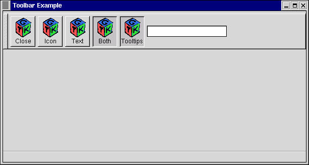
Toolbar Example Screenshot